Mercer Advisors
Humanizing Finance to Build Trust
Mercer Advisors
Humanizing Finance to Build Trust
Mercer Advisors
Humanizing Finance to Build Trust
TYPE
Corporate Website + Design System
Industry
Financial Services
Duration
8 weeks
Tools
Figma, Google Workspace, Basecamp, Bugherd, Adobe CC
Team/Role
UX/UI Design Lead — Design System, Interaction Design, Handoff
TYPE
Corporate Website + Design System
Industry
Financial Services
Duration
8 weeks
Tools
Figma, Google Workspace, Basecamp, Bugherd, Adobe CC
Team/Role
UX/UI Design Lead — Design System, Interaction Design, Handoff
TYPE
Corporate Website + Design System
Industry
Financial Services
Duration
8 weeks
Tools
Figma, Google Workspace, Basecamp, Bugherd, Adobe CC
Team/Role
UX/UI Design Lead — Design System, Interaction Design, Handoff
Professional services sites often feel cold and complex. I redesigned Mercer’s website to feel clear, trustworthy, and aligned with its purpose-driven brand. The work centered on scalable systems, editorial flexibility, and collaboration across teams.
Professional services sites often feel cold and complex. I redesigned Mercer’s website to feel clear, trustworthy, and aligned with its purpose-driven brand. The work centered on scalable systems, editorial flexibility, and collaboration across teams.
Professional services sites often feel cold and complex. I redesigned Mercer’s website to feel clear, trustworthy, and aligned with its purpose-driven brand. The work centered on scalable systems, editorial flexibility, and collaboration across teams.
The Outcome
Modernized the site with a scalable system built for clarity and growth.
The approach
Partnered across teams to deliver a flexible, user-focused system for diverse publishing needs.
The impact
Enabled 15+ team members to publish independently and scale 50+ pages.
The Outcome
Modernized the site with a scalable system built for clarity and growth.
The approach
Partnered across teams to deliver a flexible, user-focused system for diverse publishing needs.
The impact
Enabled 15+ team members to publish independently and scale 50+ pages.
The Outcome
Modernized the site with a scalable system built for clarity and growth.
The approach
Partnered across teams to deliver a flexible, user-focused system for diverse publishing needs.
The impact
Enabled 15+ team members to publish independently and scale 50+ pages.
Problem
How do you make finance feel human on a tight timeline?
Problem
How do you make finance feel human on a tight timeline?
Problem
How do you make finance feel human on a tight timeline?
Mercer’s legacy site leaned heavily on stock photography and disjointed templates—making a premium brand feel generic. Key information was buried, and the experience didn’t reflect the clarity or sophistication their clients expect.
Mercer’s legacy site leaned heavily on stock photography and disjointed templates—making a premium brand feel generic. Key information was buried, and the experience didn’t reflect the clarity or sophistication their clients expect.
Mercer’s legacy site leaned heavily on stock photography and disjointed templates—making a premium brand feel generic. Key information was buried, and the experience didn’t reflect the clarity or sophistication their clients expect.
The company had just refreshed its visual identity, but the digital experience hadn’t caught up. Our challenge was to bring warmth, trust, and structure to a compliance-heavy subject—on a tight timeline, with content still in motion.
The company had just refreshed its visual identity, but the digital experience hadn’t caught up. Our challenge was to bring warmth, trust, and structure to a compliance-heavy subject—on a tight timeline, with content still in motion.
The company had just refreshed its visual identity, but the digital experience hadn’t caught up. Our challenge was to bring warmth, trust, and structure to a compliance-heavy subject—on a tight timeline, with content still in motion.

Before: Overused stock imagery and cluttered layout diluted the brand’s premium feel, making content hard to scan and trust.
Before: Overused stock imagery and cluttered layout diluted the brand’s premium feel, making content hard to scan and trust.
Before: Overused stock imagery and cluttered layout diluted the brand’s premium feel, making content hard to scan and trust.
Discovery
Clarity for users. Flexibility for teams.
Discovery
Clarity for users. Flexibility for teams.
Discovery
Clarity for users. Flexibility for teams.
We reviewed competitor sites, analyzed Mercer’s content, and aligned with key stakeholders. Two priorities quickly surfaced:
We reviewed competitor sites, analyzed Mercer’s content, and aligned with key stakeholders. Two priorities quickly surfaced:
We reviewed competitor sites, analyzed Mercer’s content, and aligned with key stakeholders. Two priorities quickly surfaced:
Clearer Paths to Action
Prospects needed help navigating complex services
Clarity and trust were critical to engagement
The old site buried key info under generic messaging
The redesign prioritized scannability and flow
Clearer Paths to Action
Prospects needed help navigating complex services
Clarity and trust were critical to engagement
The old site buried key info under generic messaging
The redesign prioritized scannability and flow
Clearer Paths to Action
Prospects needed help navigating complex services
Clarity and trust were critical to engagement
The old site buried key info under generic messaging
The redesign prioritized scannability and flow
Empowering Internal Teams
Teams struggled with rigid templates
Publishing was slow and inconsistent
Updated CMS enabled more flexibility
Design system ensured brand consistency at speed
Empowering Internal Teams
Teams struggled with rigid templates
Publishing was slow and inconsistent
Updated CMS enabled more flexibility
Design system ensured brand consistency at speed
Empowering Internal Teams
Teams struggled with rigid templates
Publishing was slow and inconsistent
Updated CMS enabled more flexibility
Design system ensured brand consistency at speed
This wasn’t a linear process—editorial planning, stakeholder feedback, and system design unfolded in parallel. By leaning into those constraints, we shaped a foundation that could flex with changing content and still feel cohesive.
This wasn’t a linear process—editorial planning, stakeholder feedback, and system design unfolded in parallel. By leaning into those constraints, we shaped a foundation that could flex with changing content and still feel cohesive.
This wasn’t a linear process—editorial planning, stakeholder feedback, and system design unfolded in parallel. By leaning into those constraints, we shaped a foundation that could flex with changing content and still feel cohesive.
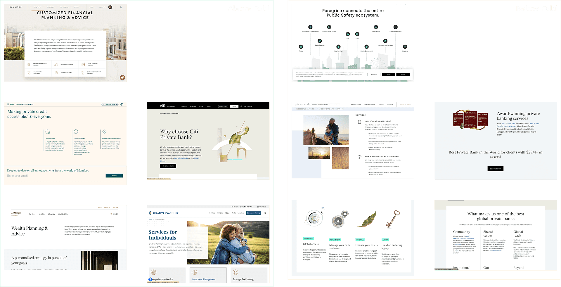
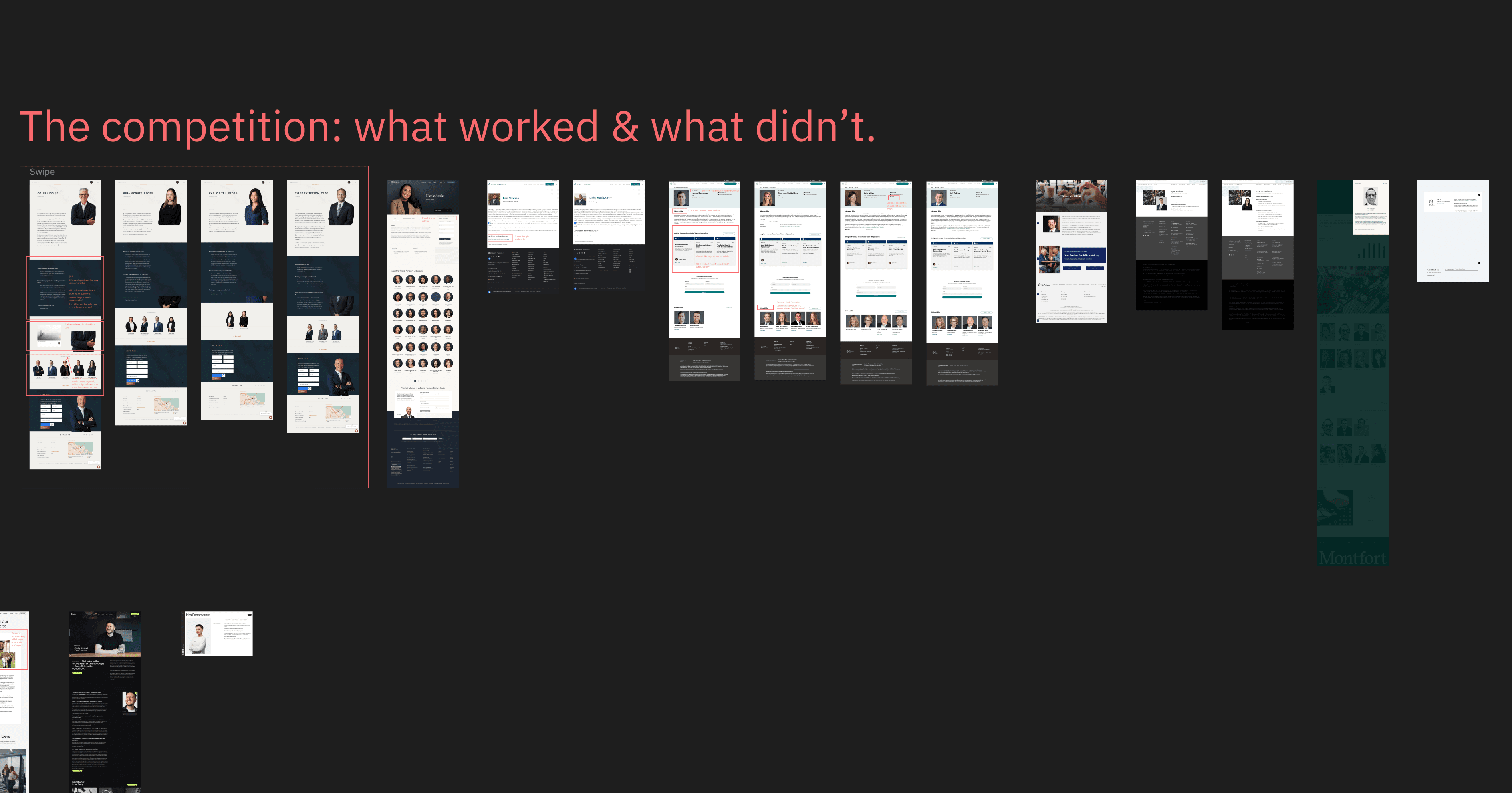
Competitive Audit
Motivated and wants structure—but often overwhelmed by inconsistent instructions.
Competitive Audit
Motivated and wants structure—but often overwhelmed by inconsistent instructions.
Competitive Audit
Motivated and wants structure—but often overwhelmed by inconsistent instructions.
From Print to Product
Adapted the brand’s printed investor guide into a scalable design system—drawing from its palette, type, and visual tone.

From Print to Product
Adapted the brand’s printed investor guide into a scalable design system—drawing from its palette, type, and visual tone.
From Print to Product
Adapted the brand’s printed investor guide into a scalable design system—drawing from its palette, type, and visual tone.
Many of the system’s foundations were shaped alongside editorial—ensuring clarity, pacing, and compliance stayed central as we moved from inspiration to interface. That groundwork helped us define patterns that could grow with the brand.
Many of the system’s foundations were shaped alongside editorial—ensuring clarity, pacing, and compliance stayed central as we moved from inspiration to interface. That groundwork helped us define patterns that could grow with the brand.
Many of the system’s foundations were shaped alongside editorial—ensuring clarity, pacing, and compliance stayed central as we moved from inspiration to interface. That groundwork helped us define patterns that could grow with the brand.
Solutions
Making Finance Feel Clear and Approachable
Solutions
Making Finance Feel Clear and Approachable
Solutions
Making Finance Feel Clear and Approachable
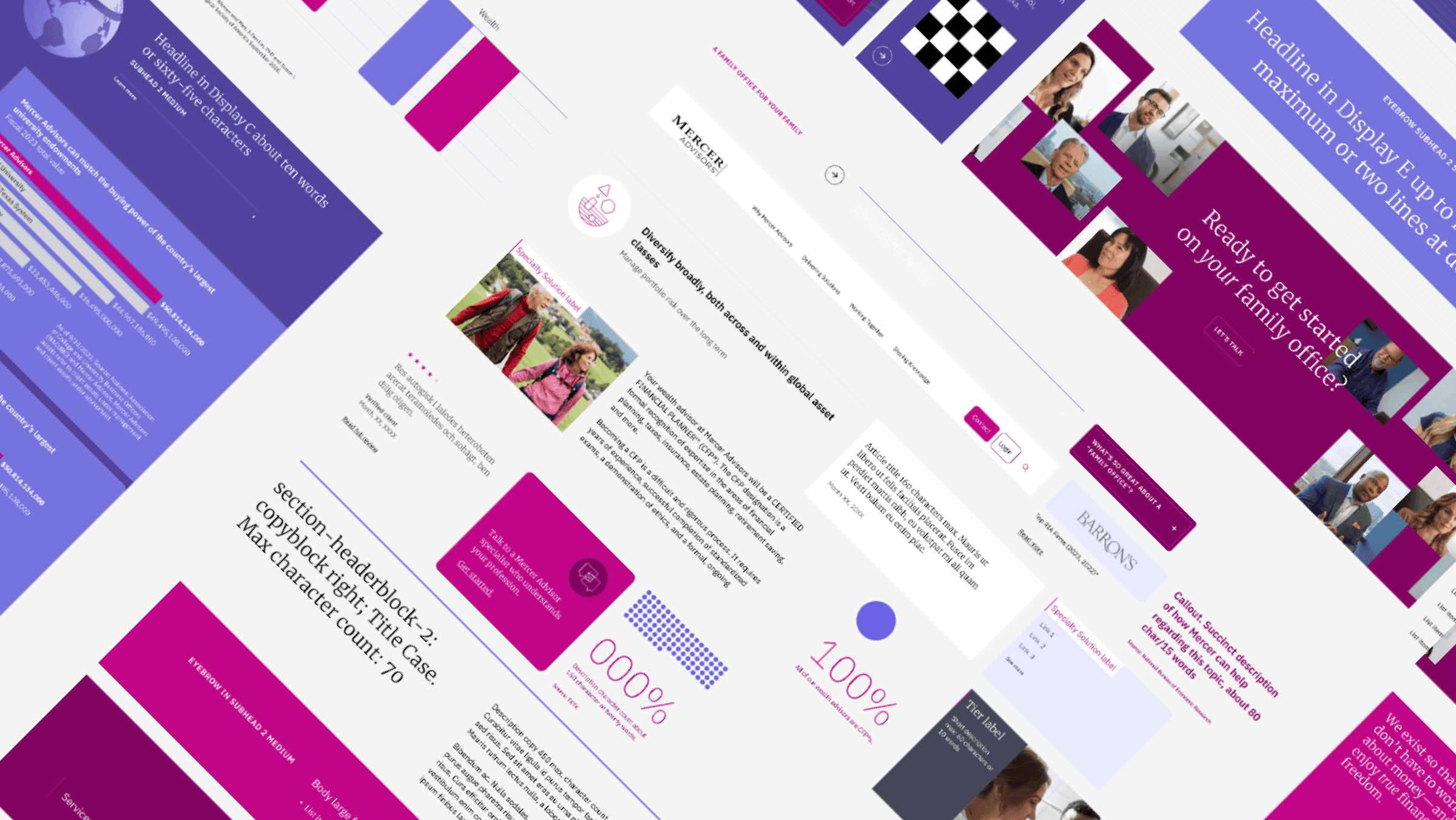
We built a flexible design system and content structure that made complex information easier to navigate—and easier to publish. Every component reflected real editorial needs, regulatory context, and the people creating the content behind the scenes.
We built a flexible design system and content structure that made complex information easier to navigate—and easier to publish. Every component reflected real editorial needs, regulatory context, and the people creating the content behind the scenes.
We built a flexible design system and content structure that made complex information easier to navigate—and easier to publish. Every component reflected real editorial needs, regulatory context, and the people creating the content behind the scenes.
Progressive Disclosure
Interactive components like accordions kept dense regulatory content readable—without losing trust or legal accuracy.
Editorial Templates
Page types were mapped to content goals, from brand storytelling to detailed service breakdowns—ensuring consistency at every level.

User-Centered Navigation
A responsive mega menu and intuitive IA helped users find their way—whether browsing services or exploring financial insights.
Design System Foundations
Modular components built for clarity, consistency, and scalability—supporting evolving content across dozens of pages.

RFI Flow
Even contact forms were redesigned with clarity in mind—balancing conversion goals with user trust and legal needs.
Progressive Disclosure
Interactive components like accordions kept dense regulatory content readable—without losing trust or legal accuracy.
Editorial Templates
Page types were mapped to content goals, from brand storytelling to detailed service breakdowns—ensuring consistency at every level.
User-Centered Navigation
A responsive mega menu and intuitive IA helped users find their way—whether browsing services or exploring financial insights.
Design System Foundations
Modular components built for clarity, consistency, and scalability—supporting evolving content across dozens of pages.
RFI Flow
Even contact forms were redesigned with clarity in mind—balancing conversion goals with user trust and legal needs.
Missed Opportunities
Bio & Location Landing Pages
Missed Opportunities
Bio & Location Landing Pages
Missed Opportunities
Bio & Location Landing Pages
The Locations and Bio pages launched with a solid foundation, but didn’t go as far as they could. With more time, we would’ve refined the content strategy, aligned earlier with stakeholders, and explored more layout options within CMS constraints. These limitations didn’t hold the project back, but they’re worth solving next time.
The Locations and Bio pages launched with a solid foundation, but didn’t go as far as they could. With more time, we would’ve refined the content strategy, aligned earlier with stakeholders, and explored more layout options within CMS constraints. These limitations didn’t hold the project back, but they’re worth solving next time.
The Locations and Bio pages launched with a solid foundation, but didn’t go as far as they could. With more time, we would’ve refined the content strategy, aligned earlier with stakeholders, and explored more layout options within CMS constraints. These limitations didn’t hold the project back, but they’re worth solving next time.
Researching Bio Page Best Practices
Explored competitor bios to identify approaches that balance professionalism with approachability, aiming to humanize advisor profiles.

Researching Bio Page Best Practices
Explored competitor bios to identify approaches that balance professionalism with approachability, aiming to humanize advisor profiles.
Analyzing Location Page Strategies
Reviewed various location pages to understand how to present office information clearly and foster trust through localized content.
Analyzing Location Page Strategies
Reviewed various location pages to understand how to present office information clearly and foster trust through localized content.
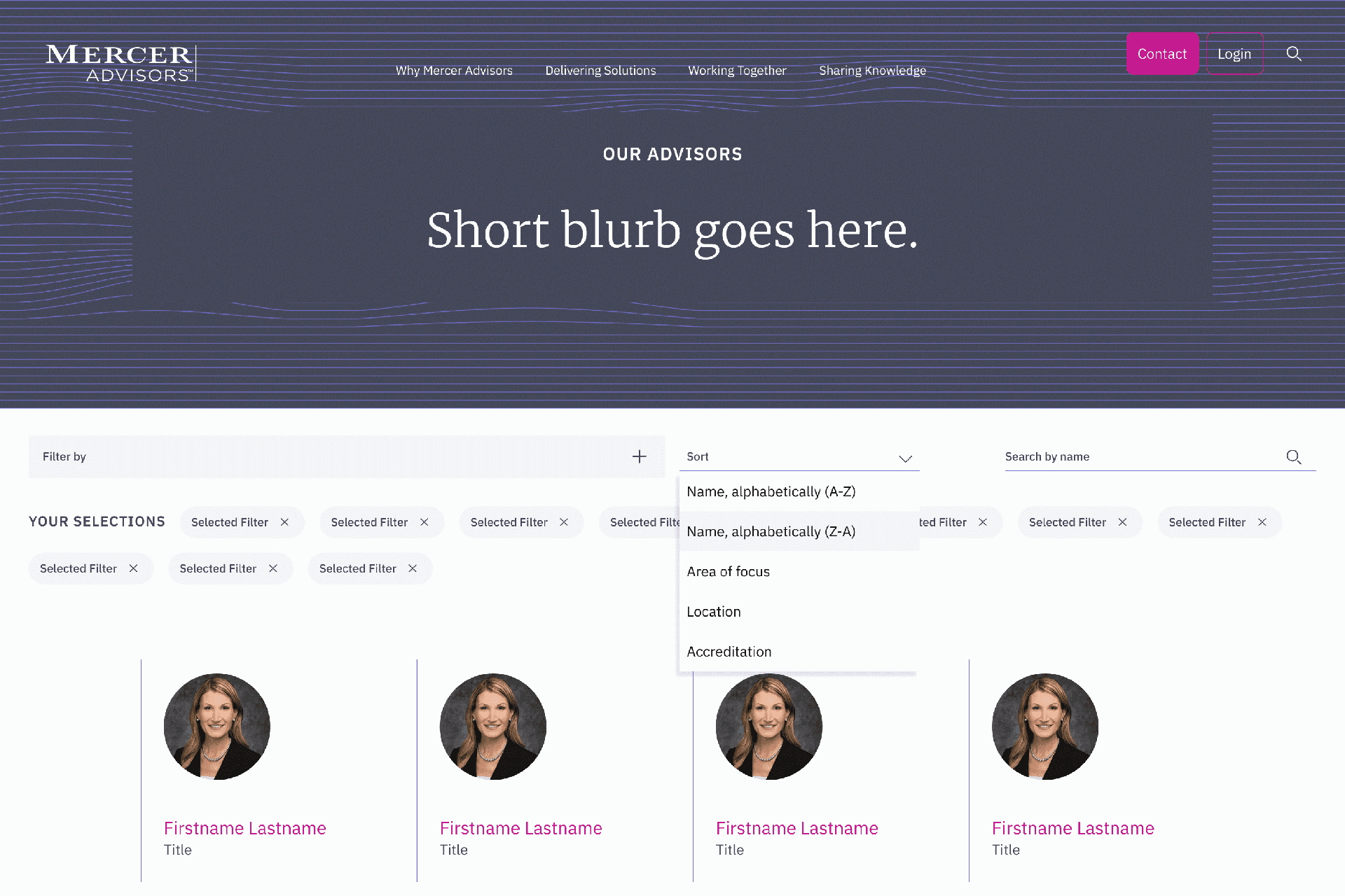
Early Sketch for Stakeholder Alignment
Developed preliminary wireframes to facilitate discussions with stakeholders, focusing on content hierarchy and user flow for key pages.
Early Sketch for Stakeholder Alignment
Developed preliminary wireframes to facilitate discussions with stakeholders, focusing on content hierarchy and user flow for key pages.
Early Sketch for Stakeholder Alignment
Developed preliminary wireframes to facilitate discussions with stakeholders, focusing on content hierarchy and user flow for key pages.
Final Outcomes
Scalable Results Under Tight Constraints
Final Outcomes
Scalable Results Under Tight Constraints
Final Outcomes
Scalable Results Under Tight Constraints
We enabled over 15 team members to publish independently, cut QA cycles in half, and delivered 50+ pages in eight weeks while maintaining 95% design fidelity. The project demonstrated how a focused system, clear priorities, and strong cross-team alignment can drive meaningful results under pressure.
We enabled over 15 team members to publish independently, cut QA cycles in half, and delivered 50+ pages in eight weeks while maintaining 95% design fidelity. The project demonstrated how a focused system, clear priorities, and strong cross-team alignment can drive meaningful results under pressure.
We enabled over 15 team members to publish independently, cut QA cycles in half, and delivered 50+ pages in eight weeks while maintaining 95% design fidelity. The project demonstrated how a focused system, clear priorities, and strong cross-team alignment can drive meaningful results under pressure.
We couldn't have made it without you
–Elizabeth Amrose, Owner and Editorial Lead at Thinkso
We couldn't have made it without you
–Elizabeth Amrose, Owner and Editorial Lead at Thinkso