reBuild
Designed for Recovery That Lasts
reBuild
Designed for Recovery That Lasts
reBuild
Designed for Recovery That Lasts
TYPE
Mobile App
Industry
Healthcare / Wellness Tech
Duration
6 weeks
Tools
Figma, Microsoft Office, Adobe CC, Google Workspace
Team/Role
UX + Product Design
TYPE
Mobile App
Industry
Healthcare / Wellness Tech
Duration
6 weeks
Tools
Figma, Microsoft Office, Adobe CC, Google Workspace
Team/Role
UX + Product Design
TYPE
Mobile App
Industry
Healthcare / Wellness Tech
Duration
6 weeks
Tools
Figma, Microsoft Office, Adobe CC, Google Workspace
Team/Role
UX + Product Design
A lightweight tool for delivering asynchronous home exercise programs that create structure, feedback, and accountability between therapists and patients. The experience is grounded in three principles: ease of use, clinical utility, and professional precision.
A lightweight tool for delivering asynchronous home exercise programs that create structure, feedback, and accountability between therapists and patients. The experience is grounded in three principles: ease of use, clinical utility, and professional precision.
A lightweight tool for delivering asynchronous home exercise programs that create structure, feedback, and accountability between therapists and patients. The experience is grounded in three principles: ease of use, clinical utility, and professional precision.
The Outcome
Supported asynchronous care through a flexible system therapists could adapt and patients could follow.
The approach
Used interviews, personas, and usability testing to guide each phase of design.
The impact
Helped therapists stay connected between sessions—gaining visibility into patient progress and follow-through.
Problem
Recovery routines shouldn’t feel like a second job.
Problem
Recovery routines shouldn’t feel like a second job.
Problem
Recovery routines shouldn’t feel like a second job.
At-home physical therapy often breaks down between visits. Patients forget their routines, lose motivation, or aren’t sure if they’re doing it right. Therapists, in turn, have limited visibility into progress or engagement.
At-home physical therapy often breaks down between visits. Patients forget their routines, lose motivation, or aren’t sure if they’re doing it right. Therapists, in turn, have limited visibility into progress or engagement.
At-home physical therapy often breaks down between visits. Patients forget their routines, lose motivation, or aren’t sure if they’re doing it right. Therapists, in turn, have limited visibility into progress or engagement.
I explored how a digital tool could support care asynchronously by giving therapists more visibility and patients a simpler way to stay on track.
I explored how a digital tool could support care asynchronously by giving therapists more visibility and patients a simpler way to stay on track.
I explored how a digital tool could support care asynchronously by giving therapists more visibility and patients a simpler way to stay on track.

Paper handouts are an inefficient and unclear method of prescribing a workout. Exercises are easier to absorb through videos, but they remain the predominant medium for therapy routines.
Paper handouts are an inefficient and unclear method of prescribing a workout. Exercises are easier to absorb through videos, but they remain the predominant medium for therapy routines.
Paper handouts are an inefficient and unclear method of prescribing a workout. Exercises are easier to absorb through videos, but they remain the predominant medium for therapy routines.
Discovery
Listening to Patients, Learning from Therapists
Discovery
Listening to Patients, Learning from Therapists
Discovery
Listening to Patients, Learning from Therapists
I began by reviewing physical therapy handouts and conducting informal interviews with patients and therapists to surface recurring friction points.
I began by reviewing physical therapy handouts and conducting informal interviews with patients and therapists to surface recurring friction points.
I began by reviewing physical therapy handouts and conducting informal interviews with patients and therapists to surface recurring friction points.
Clarity & Confidence
Patients often felt unsure whether they were “doing it right.” Without simple, supportive guidance, progress felt ambiguous and discouraging.
Clarity & Confidence
Patients often felt unsure whether they were “doing it right.” Without simple, supportive guidance, progress felt ambiguous and discouraging.
Clarity & Confidence
Patients often felt unsure whether they were “doing it right.” Without simple, supportive guidance, progress felt ambiguous and discouraging.
Motivation Between Sessions
Staying engaged was a struggle. Without consistent reinforcement, patients lost momentum and often disengaged from their routines.
Motivation Between Sessions
Staying engaged was a struggle. Without consistent reinforcement, patients lost momentum and often disengaged from their routines.
Motivation Between Sessions
Staying engaged was a struggle. Without consistent reinforcement, patients lost momentum and often disengaged from their routines.
Progress Tracking That Works
Tracking tools were either too complex or missing altogether. Simpler, more intuitivae methods were needed to help patients see their growth.
Progress Tracking That Works
Tracking tools were either too complex or missing altogether. Simpler, more intuitivae methods were needed to help patients see their growth.
Progress Tracking That Works
Tracking tools were either too complex or missing altogether. Simpler, more intuitivae methods were needed to help patients see their growth.
Show, Don’t Tell
Patients responded better to visual cues and emotional reinforcement than dense, text-heavy instructions. Less reading, more feeling.
Show, Don’t Tell
Patients responded better to visual cues and emotional reinforcement than dense, text-heavy instructions. Less reading, more feeling.
Show, Don’t Tell
Patients responded better to visual cues and emotional reinforcement than dense, text-heavy instructions. Less reading, more feeling.
I take screenshots of the PDFs and have to find it in my photo albums every time I go to the gym. This is stupid."
I take screenshots of the PDFs and have to find it in my photo albums every time I go to the gym. This is stupid."
I take screenshots of the PDFs and have to find it in my photo albums every time I go to the gym. This is stupid."
Research Sources
I reviewed physical therapy handouts, interviewed five participants, surveyed Reddit communities, and analyzed therapist forums. These early findings shaped the core needs outlined below.
Research Sources
I reviewed physical therapy handouts, interviewed five participants, surveyed Reddit communities, and analyzed therapist forums. These early findings shaped the core needs outlined below.
Research Sources
I reviewed physical therapy handouts, interviewed five participants, surveyed Reddit communities, and analyzed therapist forums. These early findings shaped the core needs outlined below.
Topic Map
An early scan of fitness behaviors, motivations, and routines—used to inform research questions and spot patterns across communities.

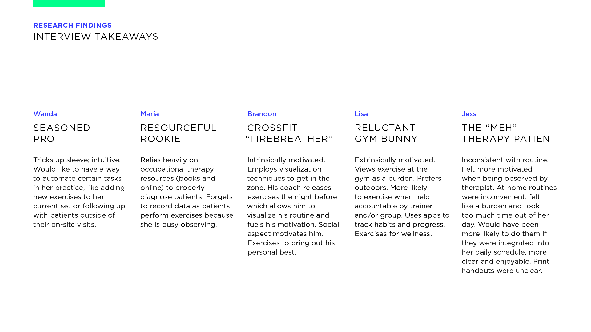
Interview Takeaways
Emerging patterns from five participants, each navigating recovery with different routines, goals, and support systems.
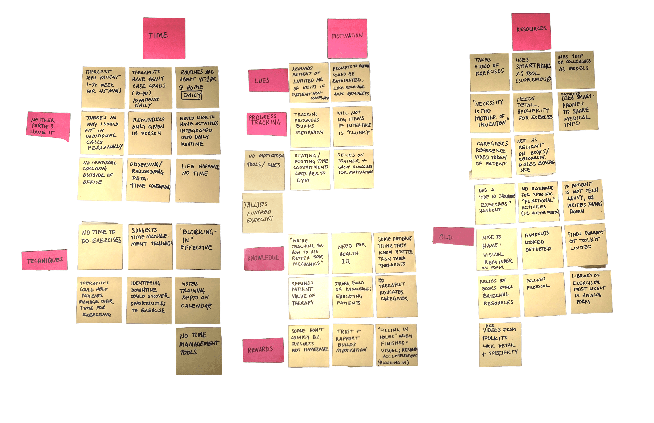
Affinity Map
Time constraints and the challenge of sticking with routines surfaced repeatedly. These themes helped prioritize features and shape flow.
Topic Map
An early scan of fitness behaviors, motivations, and routines—used to inform research questions and spot patterns across communities.
Interview Takeaways
Emerging patterns from five participants, each navigating recovery with different routines, goals, and support systems.
Affinity Map
Time constraints and the challenge of sticking with routines surfaced repeatedly. These themes helped prioritize features and shape flow.
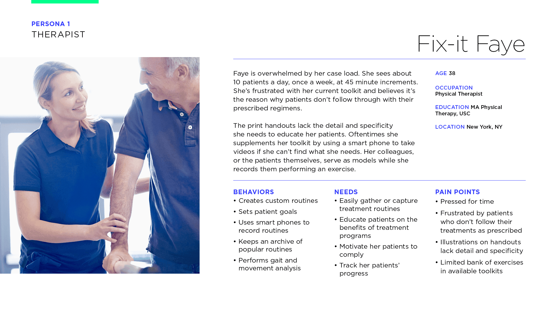
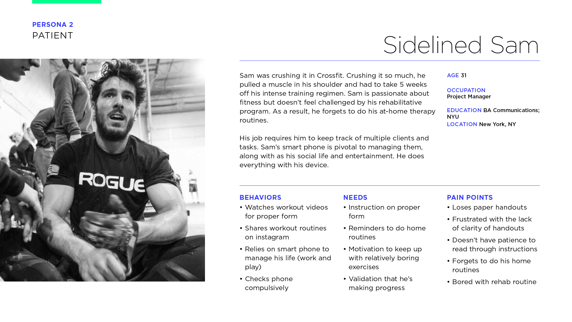
Meet the Users
The primary persona was an occupational therapist who wanted to record treatment routines instead of giving them paper handouts. This would likely increase the chance of adherence to therapy.
Meet the Users
The primary persona was an occupational therapist who wanted to record treatment routines instead of giving them paper handouts. This would likely increase the chance of adherence to therapy.
Meet the Users
The primary persona was an occupational therapist who wanted to record treatment routines instead of giving them paper handouts. This would likely increase the chance of adherence to therapy.
Fix-it Faye
Motivated and wants structure—but often overwhelmed by inconsistent instructions.
Fix-it Faye
Motivated and wants structure—but often overwhelmed by inconsistent instructions.
Fix-it Faye
Motivated and wants structure—but often overwhelmed by inconsistent instructions.
Sidelined Sam
Discouraged by past injury and reluctant to re-engage. Needs encouragement and simplicity.
Sidelined Sam
Discouraged by past injury and reluctant to re-engage. Needs encouragement and simplicity.
Sidelined Sam
Discouraged by past injury and reluctant to re-engage. Needs encouragement and simplicity.
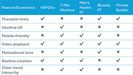
Evaluating the Competitive Landscape
Apps for consumers and apps for therapists were audited, focusing on essential features that would complete the therapist-patient feedback loop.
Evaluating the Competitive Landscape
Apps for consumers and apps for therapists were audited, focusing on essential features that would complete the therapist-patient feedback loop.
Evaluating the Competitive Landscape
Apps for consumers and apps for therapists were audited, focusing on essential features that would complete the therapist-patient feedback loop.
Feature Comparison
A scan of consumer and therapist apps showing where key features like motivation, clarity, and routine support are missing.
Feature Comparison
A scan of consumer and therapist apps showing where key features like motivation, clarity, and routine support are missing.
Feature Comparison
A scan of consumer and therapist apps showing where key features like motivation, clarity, and routine support are missing.
From Insight to Direction
Across interviews, surveys, and secondary research, a consistent set of user needs emerged: patients wanted clarity, not complexity; therapists needed flexible tools that fit their workflows; and both groups lacked confidence in current solutions.
From Insight to Direction
Across interviews, surveys, and secondary research, a consistent set of user needs emerged: patients wanted clarity, not complexity; therapists needed flexible tools that fit their workflows; and both groups lacked confidence in current solutions.
From Insight to Direction
Across interviews, surveys, and secondary research, a consistent set of user needs emerged: patients wanted clarity, not complexity; therapists needed flexible tools that fit their workflows; and both groups lacked confidence in current solutions.
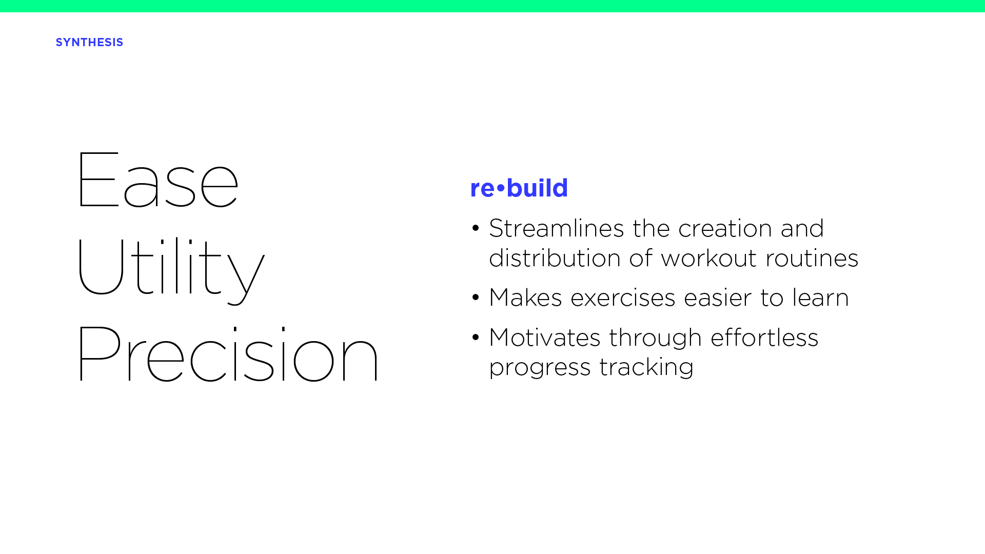
These findings led to three principles that shaped the design:
These findings led to three principles that shaped the design:
These findings led to three principles that shaped the design:
Ease
Minimize friction in completing or assigning routines.
Utility
Make each feature purposeful and task-oriented.
Precision
Support correct form and timing through clear, visual instruction.
Ease
Minimize friction in completing or assigning routines.
Utility
Make each feature purposeful and task-oriented.
Precision
Support correct form and timing through clear, visual instruction.
Ease
Minimize friction in completing or assigning routines.
Utility
Make each feature purposeful and task-oriented.
Precision
Support correct form and timing through clear, visual instruction.
Design Foundation
Principles distilled from research, setting the direction for how the product should behave, support users, and feel to use.
Design Foundation
Principles distilled from research, setting the direction for how the product should behave, support users, and feel to use.
Design Foundation
Principles distilled from research, setting the direction for how the product should behave, support users, and feel to use.
These principles guided how I prioritized features and shaped the feel of the experience.
These principles guided how I prioritized features and shaped the feel of the experience.
These principles guided how I prioritized features and shaped the feel of the experience.
Solutions
Turning Insights into Interfaces
Solutions
Turning Insights into Interfaces
Solutions
Turning Insights into Interfaces
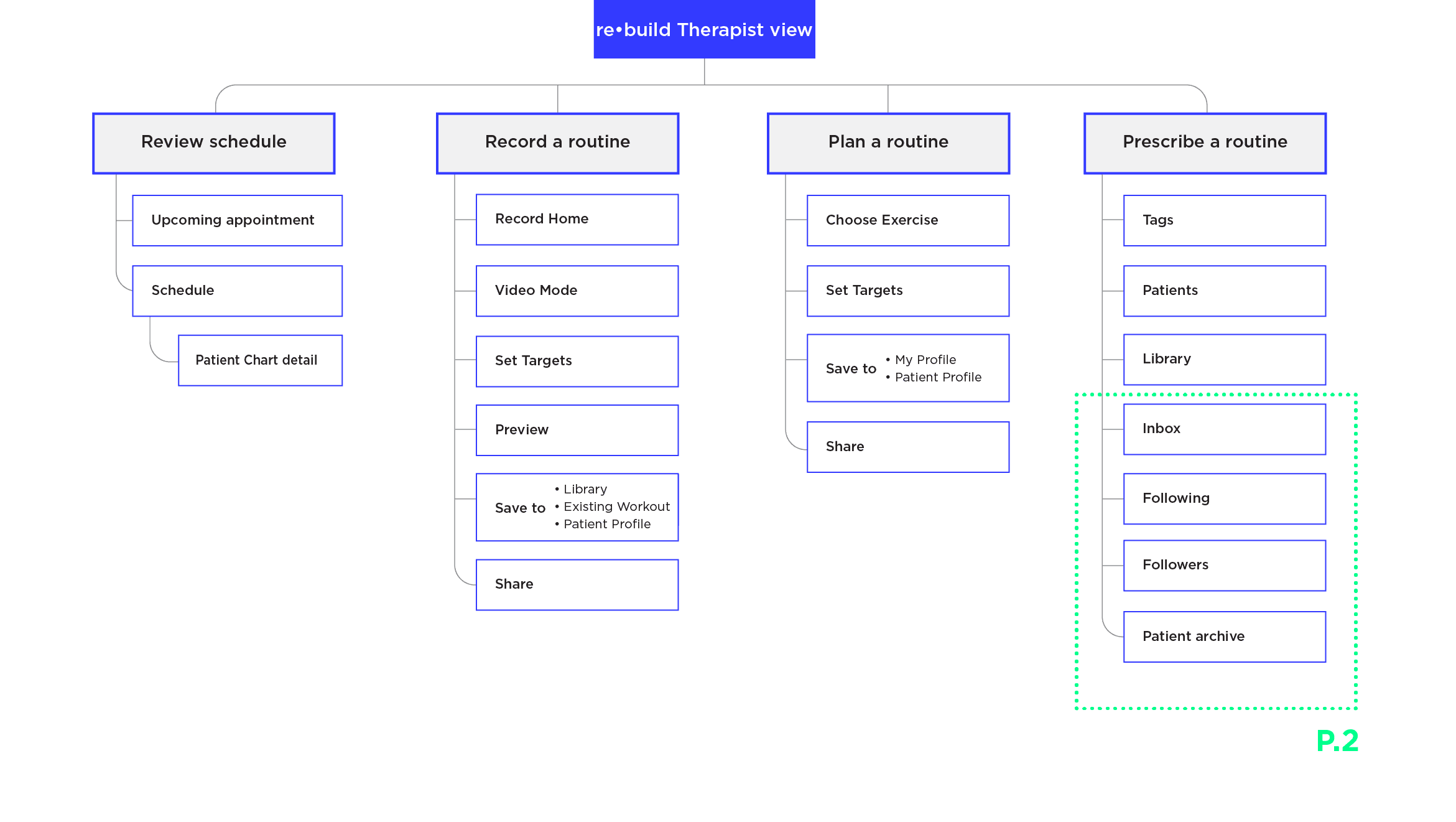
To define scope and structure, I mapped the end-to-end user flow, created an information architecture, and used a 2x2 prioritization grid to focus on features that balanced impact with feasibility. These system-level artifacts helped translate early insights into a clear product foundation—clarifying what to build, how it would work, and where to focus first.
To define scope and structure, I mapped the end-to-end user flow, created an information architecture, and used a 2x2 prioritization grid to focus on features that balanced impact with feasibility. These system-level artifacts helped translate early insights into a clear product foundation—clarifying what to build, how it would work, and where to focus first.
To define scope and structure, I mapped the end-to-end user flow, created an information architecture, and used a 2x2 prioritization grid to focus on features that balanced impact with feasibility. These system-level artifacts helped translate early insights into a clear product foundation—clarifying what to build, how it would work, and where to focus first.
2x2 grid
Evaluated features by effort and impact to identify MVP candidates.

Information Archtecture
Outlined core screens and navigation to support therapist workflows.
Creating Patient Workouts
Mapped branching logic to simplify core therapist tasks.

2x2 grid
Evaluated features by effort and impact to identify MVP candidates.
Information Archtecture
Outlined core screens and navigation to support therapist workflows.
Creating Patient Workouts
Mapped branching logic to simplify core therapist tasks.
2x2 grid
Evaluated features by effort and impact to identify MVP candidates.
Information Archtecture
Outlined core screens and navigation to support therapist workflows.
Creating Patient Workouts
Mapped branching logic to simplify core therapist tasks.
2x2 grid
Evaluated features by effort and impact to identify MVP candidates.
Information Archtecture
Outlined core screens and navigation to support therapist workflows.
Creating Patient Workouts
Mapped branching logic to simplify core therapist tasks.
2x2 grid
Evaluated features by effort and impact to identify MVP candidates.
Information Archtecture
Outlined core screens and navigation to support therapist workflows.
Creating Patient Workouts
Mapped branching logic to simplify core therapist tasks.
2x2 grid
Evaluated features by effort and impact to identify MVP candidates.
Information Archtecture
Outlined core screens and navigation to support therapist workflows.
Creating Patient Workouts
Mapped branching logic to simplify core therapist tasks.
2x2 grid
Evaluated features by effort and impact to identify MVP candidates.
Information Archtecture
Outlined core screens and navigation to support therapist workflows.
Creating Patient Workouts
Mapped branching logic to simplify core therapist tasks.
2x2 grid
Evaluated features by effort and impact to identify MVP candidates.
Information Archtecture
Outlined core screens and navigation to support therapist workflows.
Creating Patient Workouts
Mapped branching logic to simplify core therapist tasks.
Testing & Iterations
Designing for Emotional Reinforcement
Testing & Iterations
Designing for Emotional Reinforcement
Testing & Iterations
Designing for Emotional Reinforcement
reBuild was designed to support care between visits, not replace it. Each feature focused on structure, motivation, and small wins patients could manage on their own. The goal: build confidence over time without overwhelming either user.
reBuild was designed to support care between visits, not replace it. Each feature focused on structure, motivation, and small wins patients could manage on their own. The goal: build confidence over time without overwhelming either user.
reBuild was designed to support care between visits, not replace it. Each feature focused on structure, motivation, and small wins patients could manage on their own. The goal: build confidence over time without overwhelming either user.
Design Evolution
The original home screen was functional but flat. A static menu split by user type didn’t guide attention or spark momentum.
Design Evolution
The original home screen was functional but flat. A static menu split by user type didn’t guide attention or spark momentum.
Design Evolution
The original home screen was functional but flat. A static menu split by user type didn’t guide attention or spark momentum.
Testing showed users needed faster access to routines and recent uploads. I redesigned the screen as a dynamic feed that surfaces timely content and reinforces a sense of progress.
Testing showed users needed faster access to routines and recent uploads. I redesigned the screen as a dynamic feed that surfaces timely content and reinforces a sense of progress.
Testing showed users needed faster access to routines and recent uploads. I redesigned the screen as a dynamic feed that surfaces timely content and reinforces a sense of progress.
From Menu to Feed
Early concepts relied on a static menu. Testing showed users needed more context and encouragement up front, prompting a shift toward a schedule-first design.

From Menu to Feed
Early concepts relied on a static menu. Testing showed users needed more context and encouragement up front, prompting a shift toward a schedule-first design.
From Menu to Feed
Early concepts relied on a static menu. Testing showed users needed more context and encouragement up front, prompting a shift toward a schedule-first design.
Core Features
With structure in place, I focused on the routines and touchpoints that shape daily use. These mid-fidelity flows reflect small refinements that made the product feel more motivational, responsive, and easy to follow.
Core Features
With structure in place, I focused on the routines and touchpoints that shape daily use. These mid-fidelity flows reflect small refinements that made the product feel more motivational, responsive, and easy to follow.
Core Features
With structure in place, I focused on the routines and touchpoints that shape daily use. These mid-fidelity flows reflect small refinements that made the product feel more motivational, responsive, and easy to follow.
Review the day at a glance
A scrollable schedule helps therapists prepare for each session, with quick access to patient context and progress history.
Create and preview a custom exercise
From camera to library in under a minute. Therapists record movements, set targets, and review for clarity before assigning.
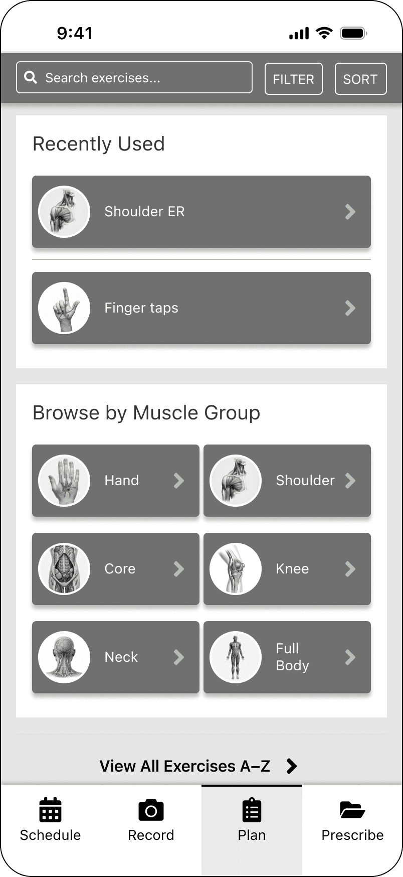
Browse and assign with ease
Quickly find and assign exercises from a personalized library.
Support progress at home
Patients complete routines with clear guidance, light feedback, and encouragement—building consistency without added complexity.
Review the day at a glance
A scrollable schedule helps therapists prepare for each session, with quick access to patient context and progress history.
Create and preview a custom exercise
From camera to library in under a minute. Therapists record movements, set targets, and review for clarity before assigning.
Browse and assign with ease
Quickly find and assign exercises from a personalized library.
Support progress at home
Patients complete routines with clear guidance, light feedback, and encouragement—building consistency without added complexity.
What Testing Confirmed & Helped Refine
Usability testing validated the overall design direction and surfaced a few meaningful adjustments. Patients responded well to the streamlined structure and conversational tone. Small tweaks, like clarifying the check-in interface, made the product feel more approachable.
Refinements included:
Refinements included:
Refinements included:
Contextual Landing Screens
Replaced static menus with dynamic, content-driven screens that surface relevant actions based on user role and timing.

Contextual Landing Screens
Replaced static menus with dynamic, content-driven screens that surface relevant actions based on user role and timing.
Contextual Landing Screens
Replaced static menus with dynamic, content-driven screens that surface relevant actions based on user role and timing.
Conversational Microcopy
Reworded prompts to sound more natural and human, reducing friction and encouraging engagement.

Conversational Microcopy
Reworded prompts to sound more natural and human, reducing friction and encouraging engagement.
Conversational Microcopy
Reworded prompts to sound more natural and human, reducing friction and encouraging engagement.
Emoji-Based Feedback
Introduced a lightweight check-in tool using emoji reactions, making it easier for patients to share how they feel at a glance.

Emoji-Based Feedback
Introduced a lightweight check-in tool using emoji reactions, making it easier for patients to share how they feel at a glance.
Emoji-Based Feedback
Introduced a lightweight check-in tool using emoji reactions, making it easier for patients to share how they feel at a glance.
It feels like something I could actually keep up with.
It feels like something I could actually keep up with.
It feels like something I could actually keep up with.
Reflection
Beyond the Prototype
Reflection
Beyond the Prototype
Reflection
Beyond the Prototype
This prototype wasn’t designed for HIPAA compliance, but it reflects the realities of clinical care: limited time, varied patient goals, and sensitive progress tracking.
This prototype wasn’t designed for HIPAA compliance, but it reflects the realities of clinical care: limited time, varied patient goals, and sensitive progress tracking.
This prototype wasn’t designed for HIPAA compliance, but it reflects the realities of clinical care: limited time, varied patient goals, and sensitive progress tracking.
The patterns developed here—modular routines, video guidance, lightweight feedback—also apply to fitness and wellness contexts, where regulatory constraints are lighter but the need for personalized, motivating experiences is just as important.
The patterns developed here—modular routines, video guidance, lightweight feedback—also apply to fitness and wellness contexts, where regulatory constraints are lighter but the need for personalized, motivating experiences is just as important.
The patterns developed here—modular routines, video guidance, lightweight feedback—also apply to fitness and wellness contexts, where regulatory constraints are lighter but the need for personalized, motivating experiences is just as important.
With a few adjustments, the system could support personal trainers or digital coaches focused on delivering measurable progress. The same core behaviors, from streamlined creation to simple feedback loops, reflect the principles that shaped the entire system.
With a few adjustments, the system could support personal trainers or digital coaches focused on delivering measurable progress. The same core behaviors, from streamlined creation to simple feedback loops, reflect the principles that shaped the entire system.
With a few adjustments, the system could support personal trainers or digital coaches focused on delivering measurable progress. The same core behaviors, from streamlined creation to simple feedback loops, reflect the principles that shaped the entire system.